

The dashboard
Read the four headline counts and the two charts, and choose a timeframe that answers the question you actually have.
The dashboard is an overview of your email statistics and performance. It is the first page you land on. Applies to all plans that send through the outbound relay.
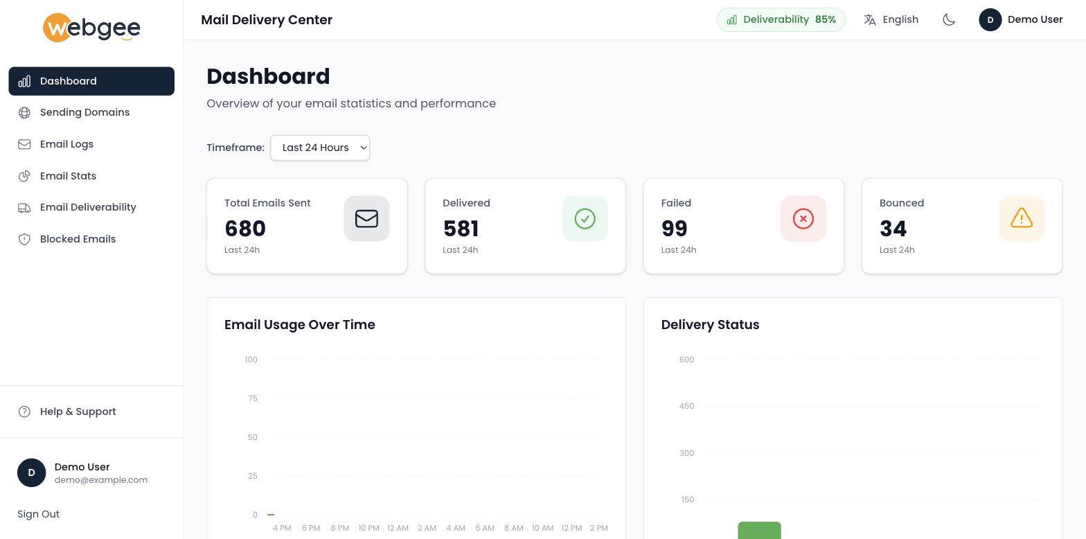
The four counts
| Card | Meaning |
|---|---|
| Total Emails Sent | Everything handed to the relay |
| Delivered | Accepted by the receiving server |
| Failed | Rejected outright |
| Bounced | Returned after initial acceptance |
Failed and Bounced are different problems. A failure is usually refused at connection time — a bad address, or a block. A bounce means the receiving server took the message and rejected it afterwards, most often a full mailbox or content filtering at the far end.
The four should reconcile: delivered plus failed plus bounced accounts for almost all of what was sent, with a small number in flight.
Timeframe
The Timeframe selector changes the period all four cards and both charts cover: Last Hour, Last 24 Hours, Last 7 Days, This Month, Billing Period or All Time.
Compare two timeframes rather than reading one. A failure rate that looks alarming over the last hour is often unremarkable across the month, and the reverse — a rate that looks fine monthly can hide a problem that started this morning.
The charts
Email Usage Over Time plots volume across the period, so you can see when sending happened rather than only how much.
Delivery Status breaks the same period down by outcome.
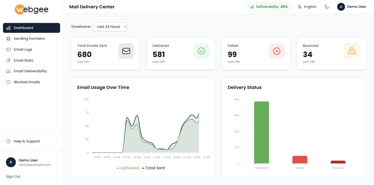
Use the usage chart to spot sending you did not expect. A flat line with one sharp spike, on an account that sends steadily, usually means an application loop or a compromised mailbox — see Email sending limits.
What to do next
- Failures rising? Open Email Logs and read the response text on the failed rows.
- One domain worse than the rest? Check Email Deliverability.
- Volume higher than expected? Break it down in Email Stats.
Related
Mail Delivery Center
See what happened to your outbound mail after it left the server — delivery rates, per-message logs, sending domains, and blocked addresses you can release.
Sending domains
Check which domains are authorised to send through the relay, confirm their SPF is valid, and know what to do when a new domain is missing.